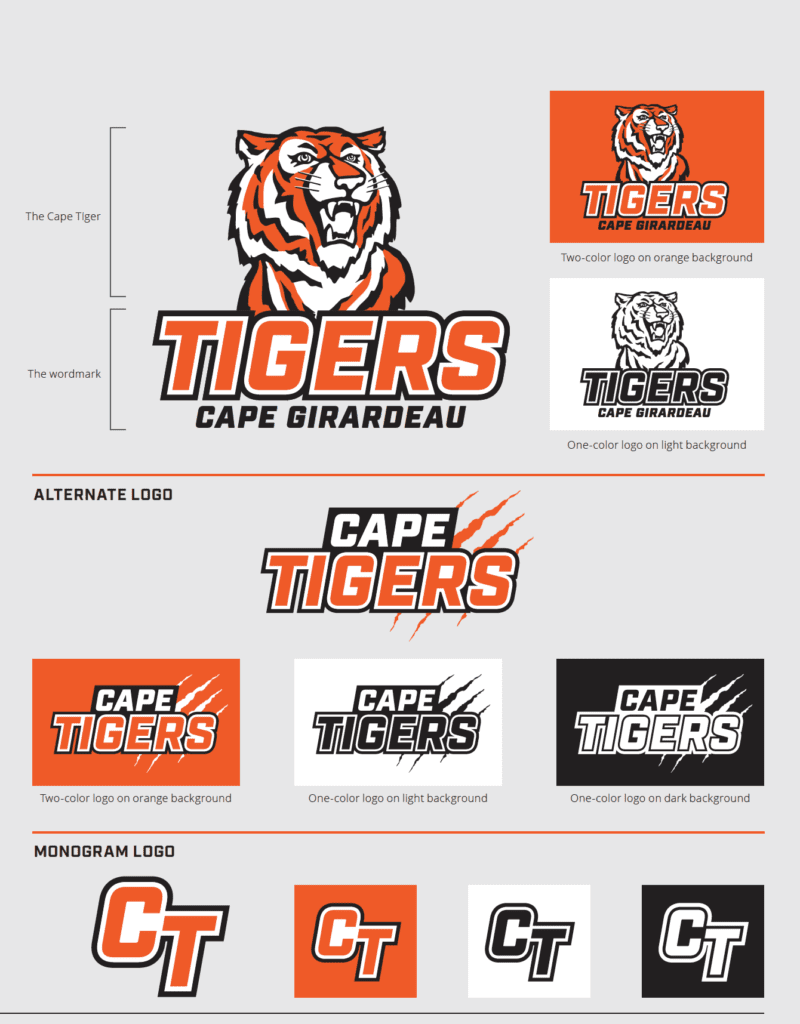
In August, Cape Girardeau Public Schools kicked off the 2020-2021 school year with an entirely new look—and it wasn’t just the masks and virtual classrooms. The district worked with Rooted Web to design new academic and athletic logos and establish brand identity and standards for the entire district, across all campuses and student clubs and sports.

Until now, Cape Girardeau Public Schools did not have a defined logo or unique Tiger mascot. One of the first steps our team took was to identify and classify the various logos and mascots currently and recently in use by the district and various sports teams.
Before creating the new marks and standards, Rooted Web worked with the District to define the core essence of the Cape Tigers brand: grit, nobleness, pride, fierceness, diversity and community. The new tiger mascot was hand-illustrated for the school district to be the embodiment of those core qualities.
In addition to the new logos, Rooted Web produced a brand guideline document to be shared with the district’s faculty and staff and any external printing, graphic or promotional vendors, ensuring brand consistency and unification across media and channels. The new brand standards incorporate the same tiger in academic and athletic logos as well as establish an updated color palette and typography to help ensure the consistency of the district’s visual identity.

“We have several Cape Tigers alumni on our team and, as members of the Cape Girardeau community, we were honored to contribute to this strong and unified visual identity for Cape Girardeau Public Schools,” said Emily Blattel, marketing manager at Rooted Web and creative director for the project.
For more information about this brand identity project or to discuss a branding project for your organization, please contact us.
Like what you're reading?
Subscribe to the blog for insightful posts delivered via email. We respect your privacy and won't spam your inbox.

